

Start with two separate questions: depth and undertone
A foundation shade name often combines several ideas, but two useful starting points are depth and undertone. Depth describes how light or deep the color appears relative to a range. Undertone is the color direction a brand uses to describe a shade family, such as warm, cool, neutral, olive, or another label. The terms are not standardized across the beauty industry. A shade called warm by one company may not sit in the same place as a warm shade in another company's chart, so compare the maker's own explanation rather than transferring letters or numbers between brands.
Think of a shade match as a product-specific comparison, not a permanent classification of your skin. Your face, neck, and chest can have different visible color; lighting and recent sun exposure also change what you see. The goal is usually to find a shade that looks cohesive where you plan to apply it, not to erase every difference between body areas. If you prefer a tint, a visibly lighter or deeper style, or no base product, those are valid choices. A shade chart is a shopping aid, not a test of skin health or identity.

Treat undertone labels as each brand's own language
Read the shade guide before interpreting its letters, abbreviations, or color names. Some brands explain their undertone codes directly; others rely on names without defining them. M·A·C's current US Foundation Shade Finder, for example, explains its own W, NW, N, NC, and C conventions and separately describes its shade-depth numbering. That is useful for navigating M·A·C's chart, but it should not be treated as a universal beauty-industry dictionary. A different brand may sort or name its colors differently.
Avoid making one clue do all the work. Vein color, whether gold or silver jewelry feels more flattering, or whether a white shirt changes how your face appears can be interesting styling observations, but none reliably identifies a foundation shade on its own. Undertone labels simplify a continuous range of colors. If you find yourself between two chart descriptions, shortlist both and compare real samples in consistent light when possible. If a brand offers artist support or a shade consultation, use its current instructions and understand that the result is a recommendation rather than a guaranteed match across every formula.
Sources: M·A·C Cosmetics US — Foundation Shade Finder and brand-specific undertone/depth system
Read the shade chart for the exact formula
Begin with the exact product name and formula you may buy. A brand can offer several foundations with different shade ranges, finishes, coverage descriptions, or formula-specific shade matches. M·A·C notes on its shade-finder page that a person's shade may vary across foundations because of formula variations. This is a reminder to confirm the chosen product itself rather than assume that a shade name or match from another line will translate unchanged. Check whether a match tool is tied to one product, one market, or a broader brand catalog.
Record the chart details that matter: the selected shade name or code, the formula, the brand's own undertone definition, and any listed range or description. If you are comparing brands, keep their labels in separate columns and compare the actual shades, not just matching words like beige, neutral, golden, or cool. Product photos may be shown on models, swatches, or digital renderings; use them as references rather than exact color standards. The page may also change after a formula update, so check the current merchant listing and shade chart before ordering.
Sources: M·A·C Cosmetics US — Foundation Shade Finder and brand-specific undertone/depth system; M·A·C Cosmetics US — Foundation collection and current product formats
Compare a swatch where you plan to wear the product
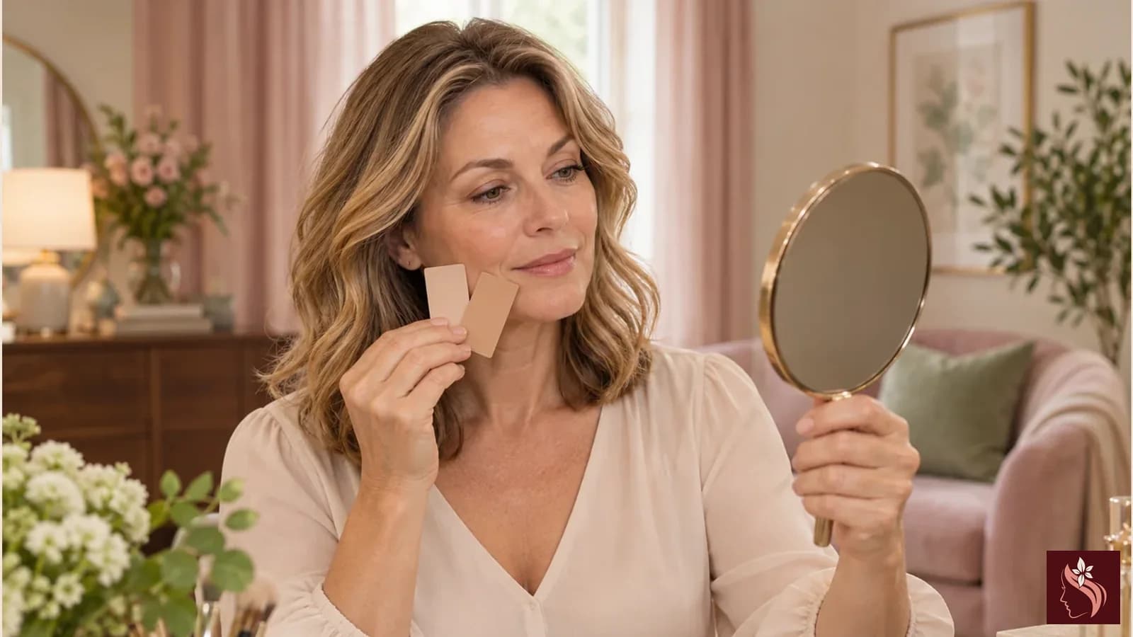
If you can sample the exact formula, follow the store or brand's hygiene directions and use a clean single-use applicator. Compare a small amount along the lower cheek or jaw and look at the transition toward the neck. A swatch on the hand or inner arm may be convenient, but those areas may not have the same visible color as the face. You do not need to cover a large area; a narrow stripe is easier to compare and remove. Let the sample sit only as long as the brand's directions suggest, and do not treat a changing appearance as proof of a particular skin condition.
Check the match in more than one ordinary setting if you can: diffuse daylight near a window, the lighting where you usually get ready, and a normal viewing distance. Avoid judging only under colored store lighting or a phone flash. Look at whether the edge is noticeable and whether the shade seems cohesive from face to neck. Take a photo only as a note for yourself; camera white balance, screen settings, and exposure can shift color. A photo is not a calibrated shade measurement, and another person's screen may render it differently.
Understand virtual matching, photos, and lighting limits
A virtual try-on or shade quiz can narrow a large catalog, especially when it asks about a current shade you already know. It remains an estimate based on the tool's inputs, image capture, and product data. Follow the brand's setup directions, use neutral lighting if requested, and make sure the camera sees your face without a strong filter. Compare any result with the brand's shade chart and sample options. If the tool suggests a match, check that its result names the exact formula and market you are considering.
Online photos cannot guarantee a perfect match. Image lighting, retouching, model skin variation, display settings, and compression all affect how a shade appears. A product can also look different in a bottle, on a swatch card, and after application. These limits matter for every complexion; they are not a reason to assume that a person with a particular skin tone will always need one undertone label. For online-only shopping, use the merchant's current shade descriptions, authorized swatches, sample availability, and return terms, and keep a backup option if returns are limited.
Sources: M·A·C Cosmetics US — Foundation Shade Finder and brand-specific undertone/depth system
When your face and neck look different
It is common to notice visible variation between the face and nearby areas. Makeup preference determines whether you want the base shade to blend toward the neck, match the face as it is, or create a deliberate styling effect. There is no single correct choice for every outfit, season, or personal preference. If you choose a shade to blend toward the neck, use a small amount and check the result in the lighting where you expect to wear it. A lighter or deeper shade can also be a chosen look, as long as you understand it is a styling decision rather than a universal matching rule.
If your usual shade looks different after a change in season, compare the current range again rather than assuming the formula changed or your skin has a problem. Avoid broad claims that makeup can diagnose or correct pigmentation, redness, acne, or another skin concern. This guide is about comparing cosmetic color labels and samples. For persistent skin changes, irritation, an allergy concern, or questions related to a diagnosed condition or treatment, ask a qualified clinician. Read the full ingredient declaration and directions for the exact item, especially if you have a known sensitivity.
Sources: U.S. Food and Drug Administration — Using Cosmetics Safely; U.S. Food and Drug Administration — Allergens in Cosmetics
A practical shade-shopping checklist
This checklist keeps observations separate from assumptions. “The brand describes this shade as neutral” is a product-chart statement. “The swatch looks close to my neck in daylight” is a personal observation. “This shade will match everyone with my skin tone” is an unsupported promise and should not be inferred. A careful comparison is useful precisely because it acknowledges what the chart can and cannot tell you.
- Write down the exact foundation formula and market; do not rely on a shade name alone.
- Use that brand's current chart to interpret its own depth and undertone labels.
- Shortlist more than one plausible shade when the chart leaves you between options.
- Sample the exact formula with a clean applicator if an authorized sample is available.
- Compare a small jawline swatch toward the neck in neutral, everyday lighting.
- Treat virtual try-on and product photos as estimates, not color guarantees.
- Check ingredients, directions, availability, return terms, and current merchant price before purchase.
Sources: M·A·C Cosmetics US — Foundation Shade Finder and brand-specific undertone/depth system; U.S. Food and Drug Administration — Using Cosmetics Safely
Conclusion
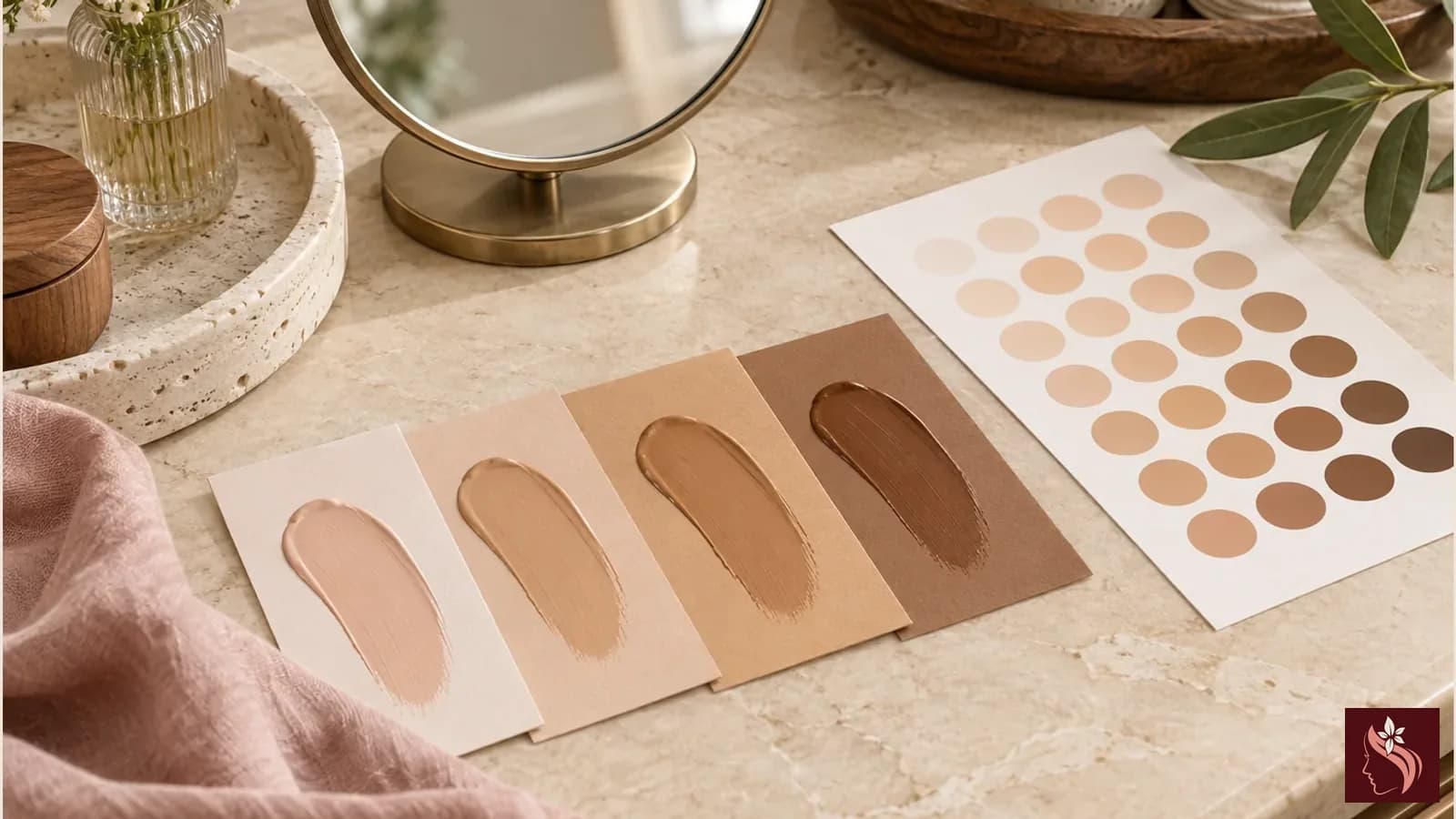
Finding a foundation shade is easier when you separate depth from the undertone language a specific brand uses. Start with the exact formula, read its own chart, and compare a real sample in steady light when that option is available. A shade name, a vein check, a model photo, or a virtual result can help narrow the search, but none can guarantee how a product will look on you.
Choose the color and finish you prefer, check the product's current label and merchant terms, and give yourself permission to skip foundation if it is not useful to your routine. Treat shade matching as a practical shopping decision, not a diagnosis or a judgment about your natural complexion.
Sources: M·A·C Cosmetics US — Foundation Shade Finder and brand-specific undertone/depth system; U.S. Food and Drug Administration — Using Cosmetics Safely
Frequently Asked Questions
What is the difference between foundation shade depth and undertone?
Depth describes how light or deep a shade appears within a range. Undertone is the color-family language a brand uses. Brand definitions vary, so check each brand's current chart.
Can I use my shade from one brand to choose another brand?
Use it as a starting clue, not a guaranteed match. Brands use different shade systems, and formula-specific matches can differ even within one brand.
Where should I swatch foundation?
If sampling is permitted, try a small amount along the lower cheek or jaw toward the neck, using a clean applicator and following store directions. A hand swatch may not represent your face.
Should foundation match my face or my neck?
That depends on the look you want and the area you plan to cover. Compare the transition in ordinary lighting and choose the result you prefer; there is no single rule for everyone.
Are virtual foundation shade finders accurate?
They can narrow choices but are estimates. Lighting, camera settings, image processing, and formula differences can affect results. Confirm the exact formula and use authorized samples where available.
Do vein color or jewelry tests identify my undertone?
They are not reliable standalone shade tests. Undertone names are brand-specific, so use the maker's chart and compare the exact product when possible.
What if my usual shade stops looking right?
Recheck the exact formula's current shade range and compare in consistent light. If you also have persistent skin changes, irritation, or a medical concern, ask a qualified clinician rather than relying on makeup guidance.
Sources
- M·A·C Cosmetics US — Foundation Shade Finder and brand-specific undertone/depth system (checked 2026-10-28)
- M·A·C Cosmetics US — Foundation collection and current product formats (checked 2026-10-28)
- U.S. Food and Drug Administration — Using Cosmetics Safely (checked 2026-10-28)
- U.S. Food and Drug Administration — Allergens in Cosmetics (checked 2026-10-28)